top of page
Mr. Wrap's
Branding & Interior Pieces
Hoboken's favorite wrap and sandwich shop since 2003 wanted a fresh look without losing its neighborhood charm. I was initially tasked with creating in-store signage to showcase the prices of drinks, chips, and sides.
Not long after, I was invited back to illustrate prints to hang around the store. As our collaboration grew, I worked closely with the owner on a complete rebrand.
Check out my work, from digital visuals to the interior of the store below!
Illustrated Prints
Original Print, painted with acrylic paint on card stock paper.
Digitized poster made in Adobe Illustrator
Before knowing I was going to be a part of a re-brand, my client expressed a need for fun art on the walls of his store, he gave me full creative freedom, as long as it was wraps and food-related art.
You can watch the design process Reel here.
Menu Designs
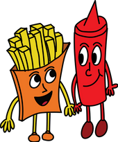
The characters from my print became a fan favorite not only for the owner, but the customers too.
I was then asked to re-design their menu for their TV screens in the store. Originally, I was asked to include photographs of the food on the menu pages, but I pitched the idea of incorporating the characters from the print to draw attention to the TV screens and emphasize a cohesive brand identity.
View all the characters below!
Merchandise
The more I incorporated these characters into the brand, the more I fell in love with them too. Once I finished up designing the menu, I had the idea of making these characters into stickers. My client put them out by the register for everyone to enjoy.
After making 100 stickers, every single one sold out on the first day! Clearly, I was not the only one in love with these guys.
This led to being tasked to designing a brand new Mr. Wrap's employee shirt. The owner requested I put my illustrated poster on the back of the shirt. I redesigned the horizontal layout to be vertical to ensure the best layout design and researched the best local print shops to this going.
Store Signage
The owner was aware of my work as a store artist at Trader Joe's grocery store and asked if I could create product signage for the store. He wanted the signs to reflect a sense of welcomeness, similar to my work at Trader Joe's.
Using acrylic paint and poster boards, I chose bright colors complimenting the interior paint and a rounded chunky font ensuring readability and playfulness.
I documented my process on the sign-making to market this great collaboration and include Mr. Wrap's loyal customers in on the fun. Click each image below to view the four part Reels series
Before
After
bottom of page